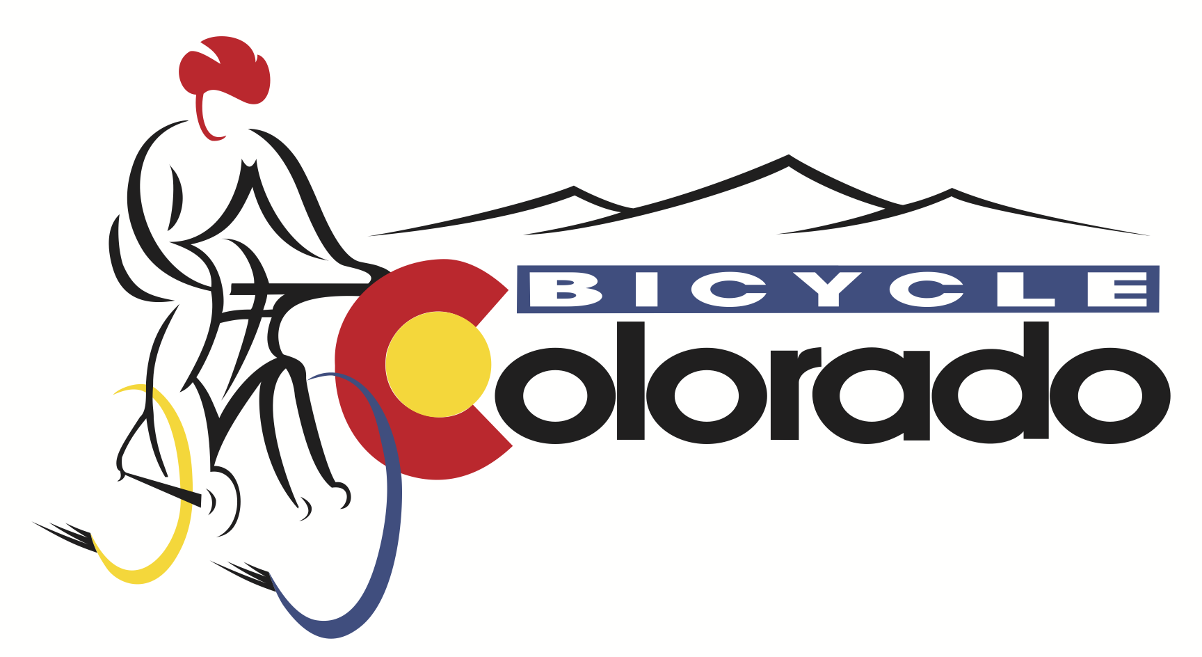
Announcing Our New Logo
Why Did We Change Our Logo?
Simply put, our work is serious and it was important that our logo and branding align with the importance of our work.
Our prior logo—a fun, badge-like design—captured the joy of cycling. It resonated with many, evoking the spirit of recreational riding across Colorado.
We have always known that our mission extends beyond merely promoting cycling for fun. We advocate for safer roads, better policies, and programs that expand access to safe riding for all bicyclists.
2024 brings the release of our new strategic plan and a logo evolution that aligns with addressing the public health epidemic of traffic violence. Our call to action is to address rising bicyclists and pedestrian fatalities, which reached an all-time high in Colorado in 2023. No matter where they are in Colorado, people of all ages and abilities have the right to bike and walk without fear for their safety.
Shield Shape
The transformation of the badge to a shield embodies the strength, protection, and urgency of our work. The shield symbolizes our role in taking a stand for bicyclists’ dignity and rights for access to safe riding across Colorado.
Colorado “CO”
We also took the Colorado “C” from the wheel in our former logo and amplified the design across the wheels. This design reflects our strategic focus on statewide work in Colorado. We care for all riders, from commuters and just-for-fun family cruisers to recreational enthusiasts and dedicated bicyclists across all ages, incomes, genders, ethnicities, physical abilities, and skill levels. In addition, we’re committed to supporting and collaborating with local advocates across the state.
Mountains
The new logo retains the original spirit of Colorado’s mountains, which have been a key element of the Bicycle Colorado logo over the years. By simplifying the design and removing the trees, the focus shifts away from specific types of riding while still referencing the iconic mountains that Colorado is known for.

1992-2004

2004-2017

2017-2024
Leave A COMMENT
Our twitter feed is unavailable right now.


COMMENTS (2)
Chuck Haraway -
Keep up the good work. I appreciate your thoughtfulness and concern. Those of us with cyclinglookoutmountain.com need what you do to matter over in Golden, as, though Lookout Mountain is generally a very safe place to cycle, some drivers make decisions that can challenge the safety of cyclists. As riders, we all need to realize that we are the vulnerable party in incidents with cars. The drivers of cars have the power, weight and momentum to make any interactive confrontations with cyclists to be seriously destructive and possibly fatal. That is why cyclists need to be proactively aware and excessively careful.
John Samara -
I like the new logo a lot. How do I get a sticker/ decal for my truck window? Thx